Let's make simple plots in Python using Matplotlib. What data do you want to see visualized?
Data's Paintbrush in Python
The Data Visualization aspect of Data Science can be scary with how many tools, IDEs, coding languages, and platforms that are available. Plus, if you're into Data Science, you may already be familiar with R and RStudio, but outside of stats, R is hardly used, and it's always good to flesh out your portfolio of skills. So take a deep breath. Let's go back to basics and start with one of the most popular coding languages today: PYTHON
Where to get started: set up
Since this is a tutorial on how to create simple plots in Python we need to have a place to use it, so if you’re coding in python, you’ll really want an interface. It doesn’t need to be anything fancy. You can use an IDE like PyCharm, a text-editor like VS Code, or a browser-based tool like Google Collab. All three of which have free options: for PyCharm Community Edition scroll down to Community Edition and select the dropdown for your computer type, for VS Code just select the download button, and Google Colab is available to anyone with a google account.
Now you’ll want to install and import a couple of libraries. For the sake of this tutorial, we’re going to use matplotlib.pyplot, and numpy. If it’s your first time using these libraries in an IDE, Text Editor, or CLI, you’ll need to install them. This line in the computer terminal is how I install it on my mac (same for a Linux): `python3 -m pip install "matplotlib"`
Pretty similar line for a windows: `py -m pip install "numpy"`
Or you can follow this tutorial by Python if you get stuck.
Once the library has been installed (which you’ll only need to do once), you’ll import the library and shorten the name you use to reference. Import libraries at the top of your file:
import matplotlib.pyplot as plt
import numpy as np
Now we’re ready to get graphing!
Plot Production
Line Graphs
Line Graphs are a great way to visualize trends in data. They’re used for line of best fit, displaying the relationship between simple datasets or two parts of a more complex dataset. The x-axis is typically used to measure the time over which data is measured. Examples of line graphs include: stocks over hours, weight over months, price over season, # of ticket sales per day, etc.
The first part of the code for the line graph is defining our line graph function and looks like this:
def line(x_points, y_points, color):
    plt.plot(x_points, y_points, color = color)
    plt.show()
.plot and .show come from the matplotlib library and accessed using our shortcut “plt”
The function by itself doesn’t do anything because we need to define the data. You can do that using two lists of the same length:
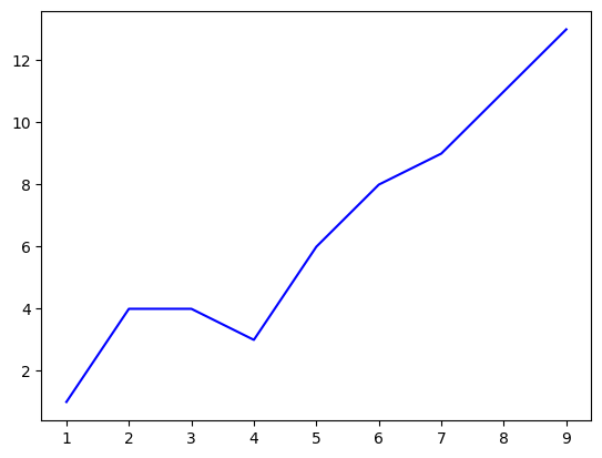
x = [1, 2, 3, 4, 5, 6, 7, 8, 9]
y = [1, 4, 4, 3, 6, 8, 9, 11, 13]
line(x, y, 'b')  # calls on the function we just made
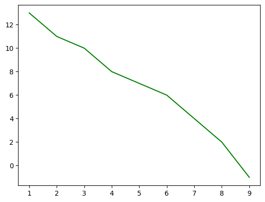
Or you can define a matrix/array with numpy:
data = np.array([[1, 13], [2, 11], [3, 10], [4, 8], [5, 7], [6, 6], [7, 4], [8, 2], [9, -1]])
line(data[:, 0], data[:, 1], 'g')
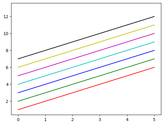
What if you want to add more that one line? Well, matplotlib.pyplot offers many colors which can help you distinguish lines, and putting multiple plt.plots before a plt.show will let you put multiple lines on a single graph.
def colors():
    x_points = [0, 1, 2, 3, 4, 5]
    line1_y_points = [1, 2, 3, 4, 5, 6]
    line2_y_points = [2, 3, 4, 5, 6, 7]
    line3_y_points = [3, 4, 5, 6, 7, 8]
    line4_y_points = [4, 5, 6, 7, 8, 9]
    line5_y_points = [5, 6, 7, 8, 9, 10]
    line6_y_points = [6, 7, 8, 9, 10, 11]
    line7_y_points = [7, 8, 9, 10, 11, 12]
    line8_y_points = [8, 9, 10, 11, 12, 13]

    plt.plot(x_points, line1_y_points, 'r')  # red
    plt.plot(x_points, line2_y_points, 'g')  # green
    plt.plot(x_points, line3_y_points, 'b')  # blue
    plt.plot(x_points, line4_y_points, 'c')  # cyan
    plt.plot(x_points, line5_y_points, 'm')  # magenta
    plt.plot(x_points, line6_y_points, 'y')  # yellow
    plt.plot(x_points, line7_y_points, 'k')  # black
    plt.plot(x_points, line8_y_points, 'w')  # white

    plt.show()

colors()
Adding labels adds even more info! You could say it’s pretty cool.
def multi_lines_and_labels():
    x_points = [0, 1, 2, 3, 4, 5]
    y1_points = [6, 7, 8, 9, 10, 10]
    y2_points = [4, 5, 6, 5, 7, 10]

    plt.plot(x_points, y1_points, label="You", color = 'b')
    plt.plot(x_points, y2_points, label="Me", color = 'r')

    plt.title("Our Coolness Levels")
    plt.xlabel("Months learning Data Science")
    plt.ylabel("Coolness Level")

    plt.legend()
    plt.show()

multi_lines_and_labels()

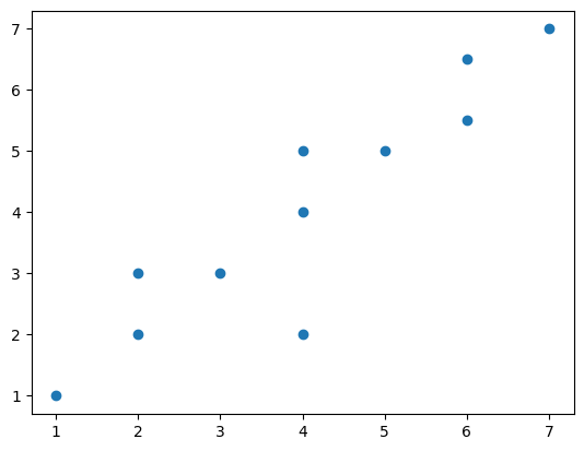
Scatter Plots
Another way to visualize the relationship between two data catagories is a scatter plot. Rather than looking at the general trend line, scatter plots allow us to see points and their density. It also makes it easier to see points that have repeated x or y values.
def scatter(x_points, y_points):
    plt.scatter(x_points, y_points)
    plt.show()


x3 = [1, 2, 2, 3, 4, 4, 4, 5, 6, 6, 7]
y3 = [1, 3, 2, 3, 2, 4, 5, 5, 5.5, 6.5, 7]
scatter(x3, y3)
Bar Graphs
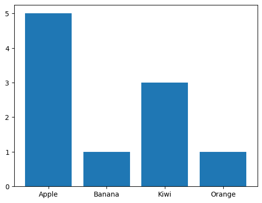
Bar Graphs are a way to visualize the counts of your different factor levels or categorical data.
If you had a bag of fruit, and wanted to see how many of each type you have, bar graphs are a way to see that! In this example we have a lot more Apples than any other fruit.
def bar(categories, counts):
    plt.bar(categories, counts)
    plt.show()


fruit = ['Apple', 'Banana', 'Kiwi', 'Orange']
f_counts = [5, 1, 3, 1]
bar(fruit, f_counts)
Histograms
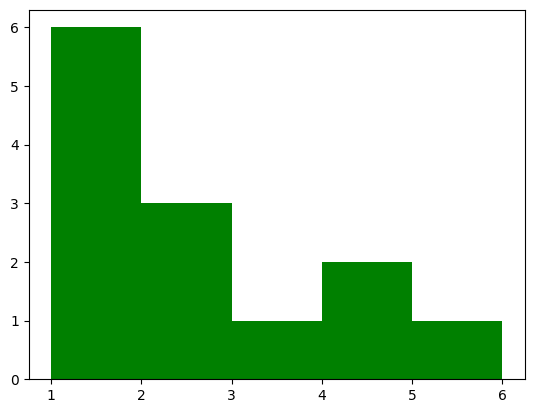
def hist(frequencies):
  plt.hist(frequencies, [1, 2, 3, 4, 5, 6], color = 'g')
  plt.show()

freq = [
    1, 1, 1, 1, 1, 1,  # 6 ones
    2, 2, 2,  # 3 twos
    3,  # 1 three
    4, 4,  # 2 fours
    5  # 1 five
]
hist(freq)
Density Plot
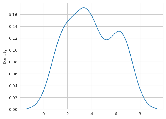
A density plot is used for the same thing as a histogram, but is a more accurate way to view the changes in data.
import numpy as np
import seaborn as sns
data = [1.5]*7 + [2.5]*2 + [3.5]*8 + [4.5]*3 + [5.5]*1 + [6.5]*8
sns.set_style('whitegrid')
sns.kdeplot(np.array(data), bw_method=0.5)
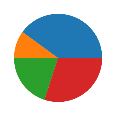
Pie Charts: The Bane of Statisticians Existances
Seriously, do not use pie charts for stats. Pie charts make it hard to actually tell the proportions between real data, so this is only for your information. Use at your own risk.
def pie():
    counts = [4, 1, 2, 3]
    plt.pie(counts)
    plt.show()
pie()
You can do it!
Granted, those were just the basics of data visualization in python, but everyone’s got to start somewhere. In my experience, I learn how to code best when I copy someone elses code and turn it into my own thing, so I invite you to do the same. Get PyCharm, VS Code, or Google Collab and try out these graphs for yourself. Switch up the numbers, colors, and data, and don’t be afraid to use Google or ChatGPT for ideas on how to expand the functionality of the graphs. If you want to go even further, explore these other data visualization libraries.
Thanks for being willing to explore data visualization in python with me. Good luck coding in color!