If you'd like to explore more of the Disney stock and movie data I scraped before, I've got just the app for you. Let's explore how interactive tools like Streamlit allow you to get a better picture for data visualization.
When You Wish Upon a Streamlit App: Disney Data continued
Data visualization gets even more memorable when it can be played with. Static images can show you a good overview, but if a picture's worth a thousand words, then a movie should be worth 100 million. Pull up the webapp side by side if you'd like to see the value. (And check out the GitHub repo for the full code I used.) Together we can answer the question: How has Disney been doing as a company over the last few years?
How to build a Streamlit app
You can attach your github account to streamlit and deploy an app directly from there by signing up for the free community cloud and signing in with your github account. Once you have an account, you can deploy an app by someone else, or initialize a new repo for your app, create a main.py file (or whatever you’d like to call it) and a requirements.txt file, and get to writing. If you’re making one for yourself, you’ll need to import the streamlit library, plotly for interactive plots, and probably a few others. My import list on main.py looked like this for this app:
import streamlit as st
import numpy as np
import pandas as pd
import plotly.express as px
import matplotlib.pyplot as plt
from io import BytesIO
import plotly.graph_objects as go
from plotly.subplots import make_subplots
Any and all libraries that you need for the app need to be included on new lines in your requirements.txt file (like this). Once all that is done, you can deploy your app and see what your code affects in real time.
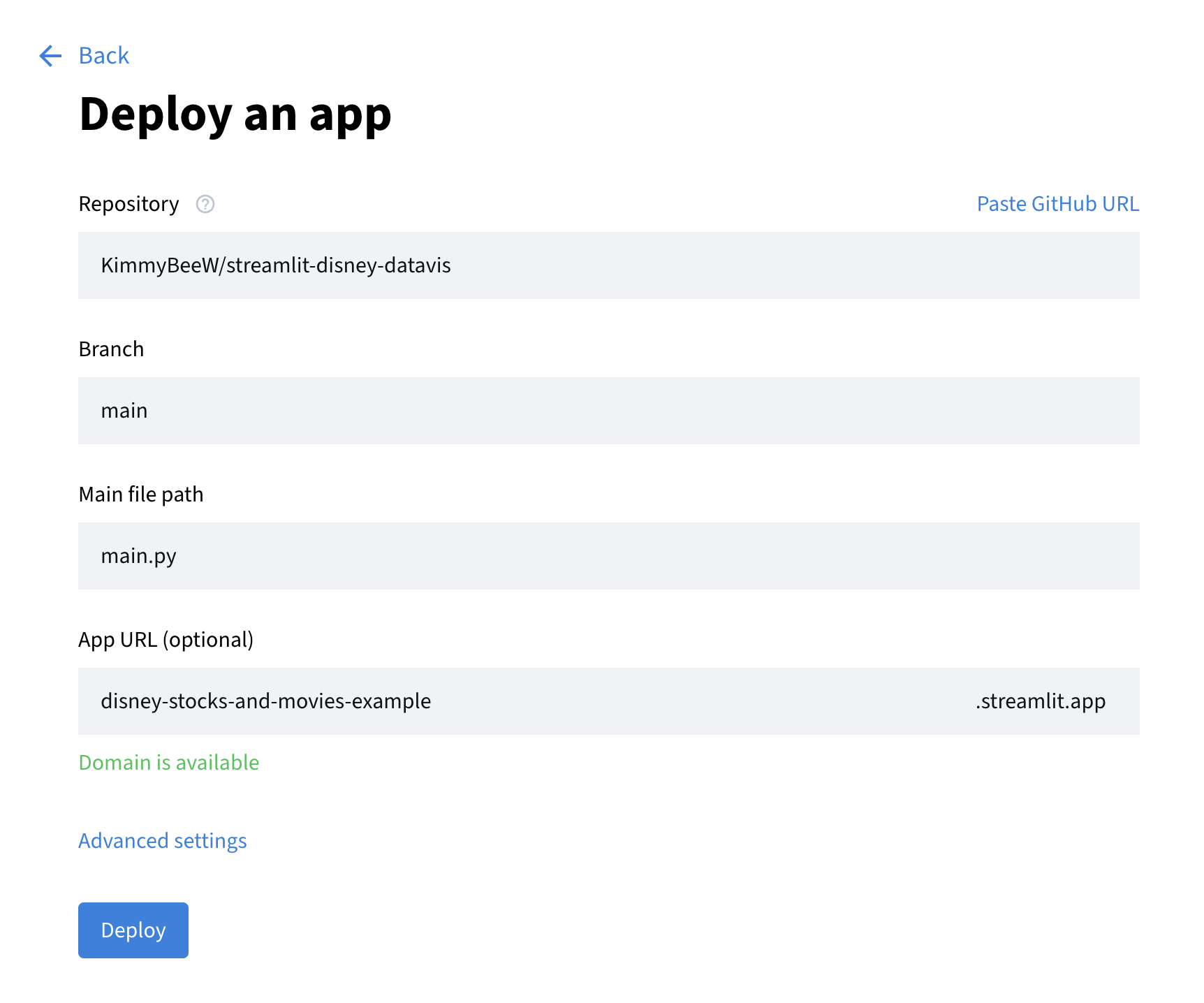
Go to share.streamlit.io and click “Create app” in the top right corner. If you’re doing it through GitHub like me you’ll select the “Deploy a public app from GitHub”. Now select the repo that your code is in, select the main or master branch, select the title of your main.py file, and create a custom url for your app. The url I chose for my app is disney-stocks-and-movies.streamlit.app. Select deploy and you’ll be able to visit your app at the link you just created.
Before you do any data visualization you’ll need some data to visualize. Since I wanted to find out more about my Disney data, I read that in. In your main.py file under the import statements you can read in as many data sets as you want by using code that looks like this:
@st.cache_data  # the decorator so the app can read the data
def load_stock_data():  # function for data source
    url = 'https://github.com/KimmyBeeW/Disney-Web-Scraping/raw/main/datasets/all_disney_stocks.csv'
    stocks = pd.read_csv(url, index_col = 0)  # read it into a DataFrame
    return stocks  # return DataFrame

stocks = load_stock_data()  # call the function and assign to variable
And don’t forget to give your new app a title!
st.title("Disney Stocks and Disney Brands Box Office Numbers")
Play with the Data
It’s now time to add your interactive elements and make some discoveries about your data! You can use tools like a sidebar to really optimize your data visualization.
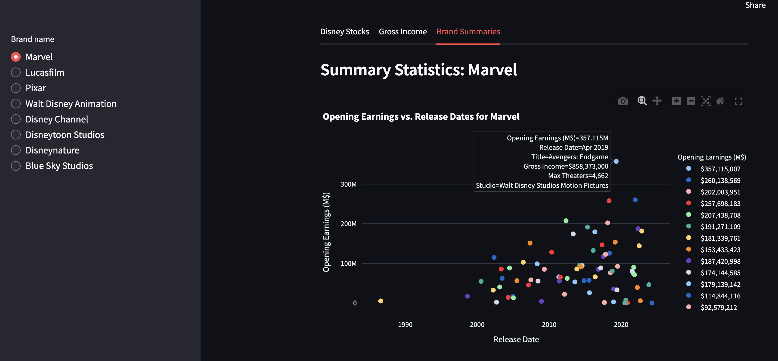
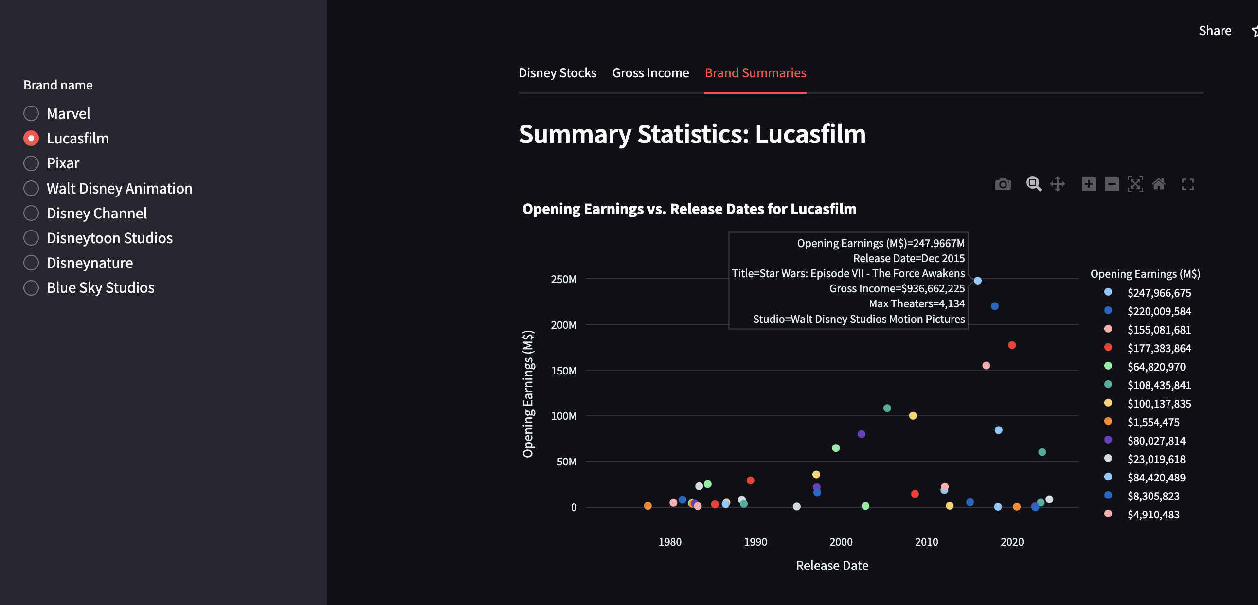
with st.sidebar:  # interactive side bar
    brands = st.radio('Brand name', ['Marvel', 'Lucasfilm', 'Pixar', 'Walt Disney Animation', 'Disney Channel', 'Disneytoon Studios', 'Disneynature', 'Blue Sky Studios'])
Or maybe you’d like to use different tabs to visualize your data. I always love a good line graph for time data:
tab1, tab2, tab3, tab4 = st.tabs(["Disney Stocks", "2nd tab", "3rd tab", "4th tab"]) # switch out the names obviously
with tab1:
# slider for range of the graph dates
startyear_input = st.slider('Start Year', min_value = 1962, max_value=2024, value=2021)
endyear_input = st.slider('End Year', min_value = 1962, max_value=2024, value=2024)
filt_stocks = stocks[(stocks['Date'] >= pd.Timestamp(startyear_input, 1, 1)) &
(stocks['Date'] <= pd.Timestamp(endyear_input, 12, 31))].copy()
# make it possible to see all four lines
mlt_stocks = filt_stocks.melt(id_vars='Date', value_vars=['Close', 'Open', 'High', 'Low'],
var_name='Type', value_name='Price ($)')
# custom colors
val_colors = {'High': '#29b6f6', 'Low': '#a80930',
'Close': '#efb71d', 'Open': '#2bb007'}
# plot the stocks
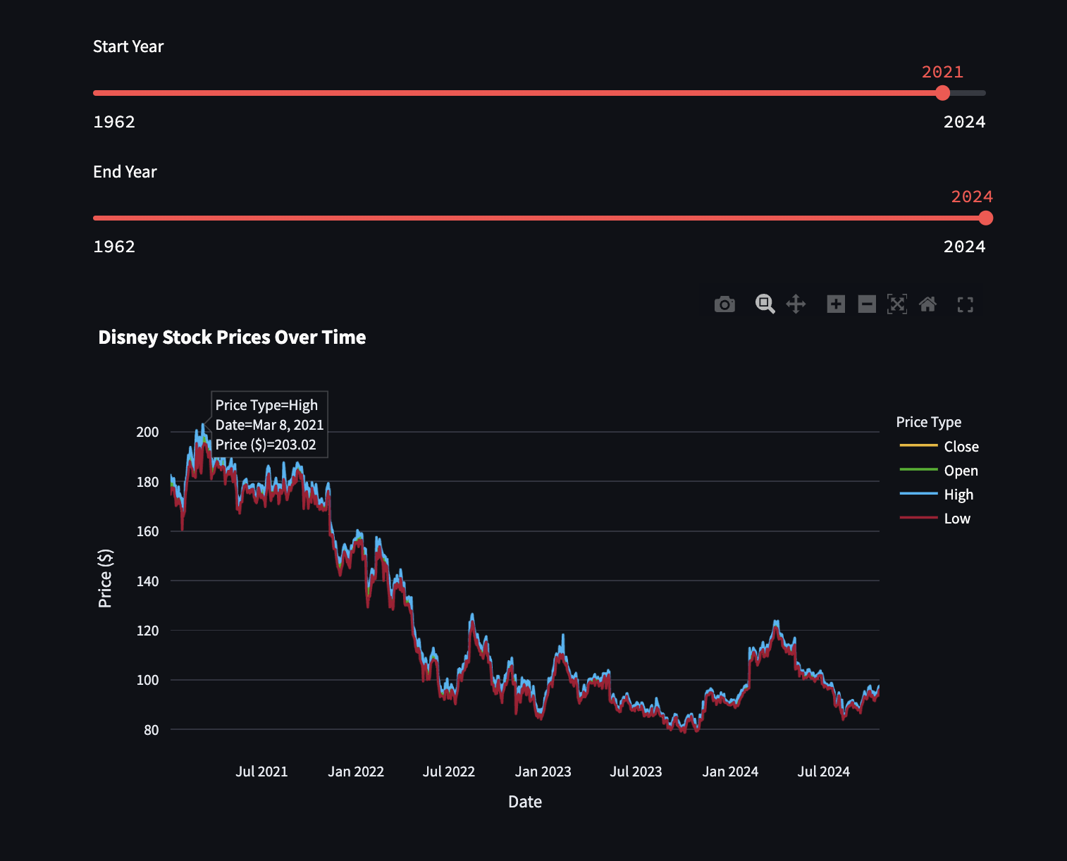
fig = px.line(mlt_stocks, x='Date', y='Price ($)', color='Type',
title='Disney Stock Prices Over Time',
labels={'Price': 'Stock Price', 'Type': 'Price Type'},
color_discrete_map=val_colors)
st.plotly_chart(fig)
Now I can see a wide range of years and really put into perspecive how Disney’s stocks are doing. Hovering over the peak allows me to see that Disney’s highest stock price in the last few years was $203 back in March of 2021 and that it hasn’t been that high since. But I could play with the slider and go check out how Disney was doing back in the 1960s if I wanted to.
Those sidebar buttons from earlier can be used to look at the data from different brands so you can see patterns like peaks in the late 2010s and how none of the newer movies have even gotten close to the same opening revenue. Of course part of that can be explained by the change in culture following the pandemic in 2020, but it also coincides with the release of Disney+ in November of 2019.
Interested in more ways to visualize your data? Me too! Streamlit has lots of resources for learning about their cool features like input widgets, tabs, and the sidebar. And of course if you want to continue learning from my code, you can always check out my repo and the code I used to implement the cool features in my streamlit app.
At Last I See The Light
Building my little app helped me see my data in a clearer light, and it really did help me understand the patterns I noticed before to a deeper level. The stocks are definitely sinking, and the movies are aligning with that pattern, but hopefully Disney can learn from its past mistakes and bring back the magic. For now I hope this little tutorial brought some magic to your life, and that you’ll continue to enjoy coding in color!